
Brand Guide
A living reference for how Glimmer looks, sounds, and feels — for our team, our partners, and everyone helping bring the brand into the world.
Celebration, without compromise.
Glimmer is a premium dealcoholized sparkling wine — crafted from real, traditionally fermented wine, gently stripped of alcohol using a low-temperature process that preserves aroma, structure, and flavour. Not grape juice. Not a mocktail. True wine, without the alcohol.
We exist to preserve the ritual of raising a glass — the pour, the stemware, the toast, the shared moment — without the physical, emotional, or social costs that can come with alcohol. Glimmer is positioned as a luxury alternative to Champagne and sparkling wine, a wellness-aligned lifestyle choice, and an inclusive beverage for every table.
Elevated
Minimal, luminous, blush-and-gold. Every detail feels intentional and worthy of the occasion.
Inclusive
Built for every guest at the table — sober-curious, wellness-focused, expecting, or simply choosing clarity.
Real
Traditionally fermented wine, gently dealcoholized — not a substitute, not an afterthought.
Present
A life that feels good before, during, and after the moment.
"Glimmer delivers the elegance, ritual, and sophistication of traditional Champagne — without the alcohol, the excess calories, or the next-day regret. It's not about giving something up. It's about upgrading your glass to match the life you're building."
Warm luxury wellness.
Glimmer sounds like a gracious host, not a distant luxury label: calm, sincere, and quietly confident. We explain and celebrate without ever sounding clinical or like we're selling something. The reader should finish feeling informed, uplifted, and included — never pressured.
Write like a gracious host — warm, inclusive, celebratory. Favor short, declarative sentences with the occasional fragment for emphasis. Frame alcohol-free living as an upgrade, not a restriction.
Sound clinical, preachy, or apologetic. Avoid hype, superlatives, and hard-sell calls to action. Never frame the absence of alcohol as something being "missed."
The mark.
The Glimmer script is warm and handwritten, topped with a four-point sparkle. It should always have room to breathe — never crowd it with other type or imagery, and never recolor, outline, or distort the script.
— Submark
Use the iridescent version as the default. Use the gold version for warm, celebratory or festive contexts. Always give the mark clear space equal to the height of the sparkle on all sides.
Place the iridescent or gold mark on busy photography without a solid or softly blurred backing. Don't stretch, rotate, or recreate the wordmark in another font.
Blush, gold, and warmth.
Our palette stays soft, warm, and luminous — no pure black, no cool grays. Since the Rosé launch, the system runs two label colourways plus a shared brand palette below.
Two typefaces, one voice.
Cormorant Garamond carries the emotion — headlines, taglines, and body copy. Questrial handles structure — eyebrow labels, navigation, and fine print, always uppercase with generous letter-spacing.
The bottle and the can.
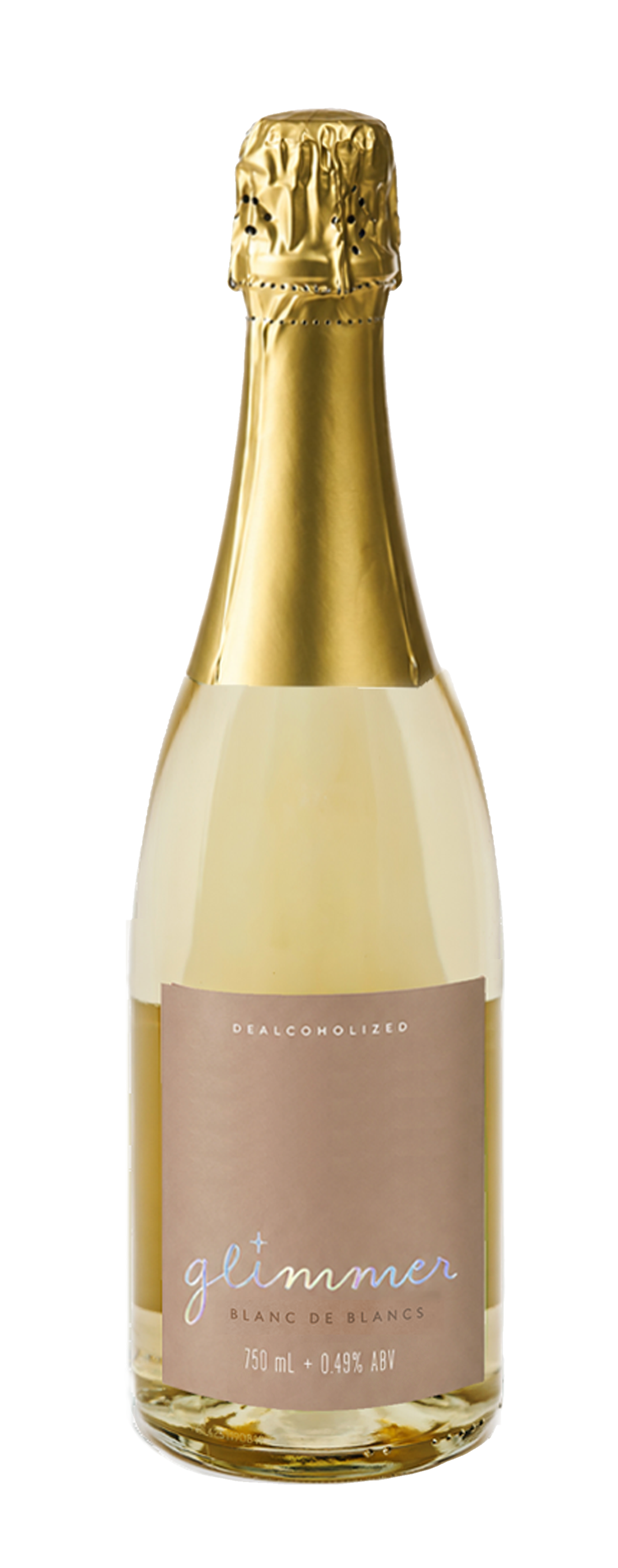
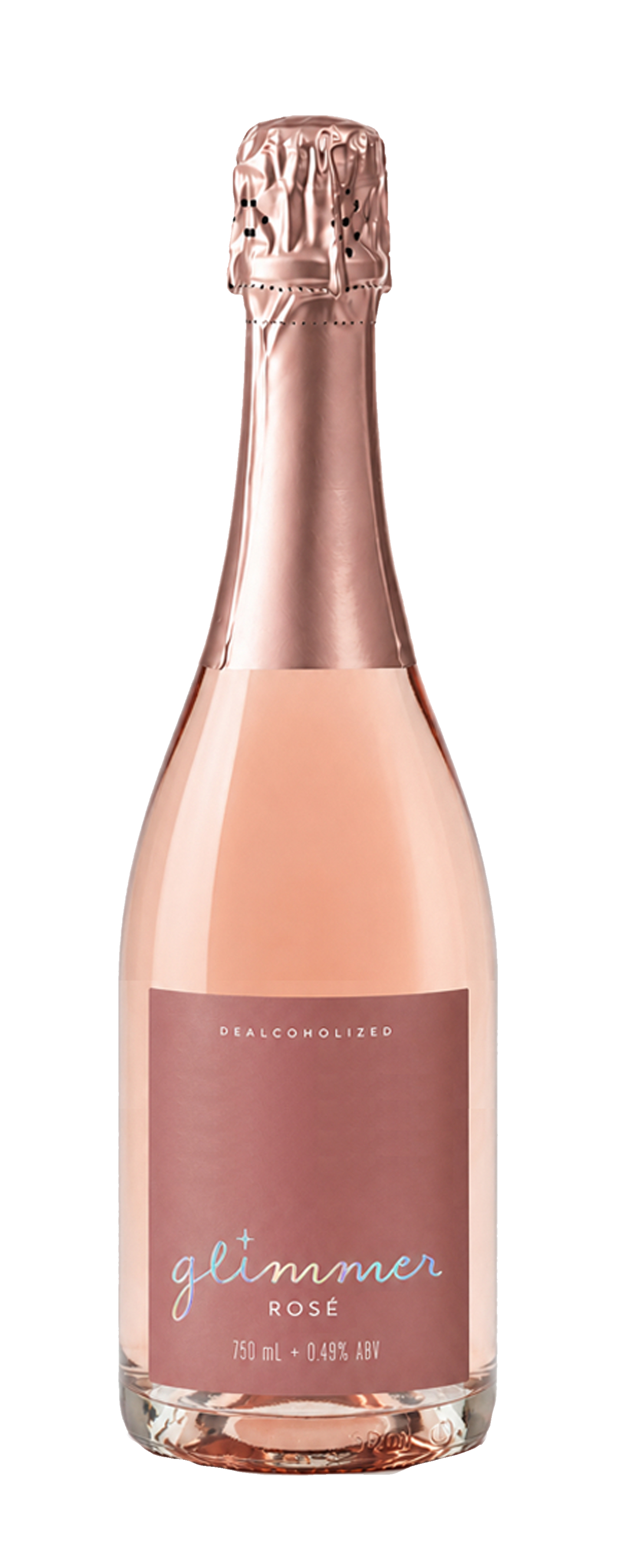
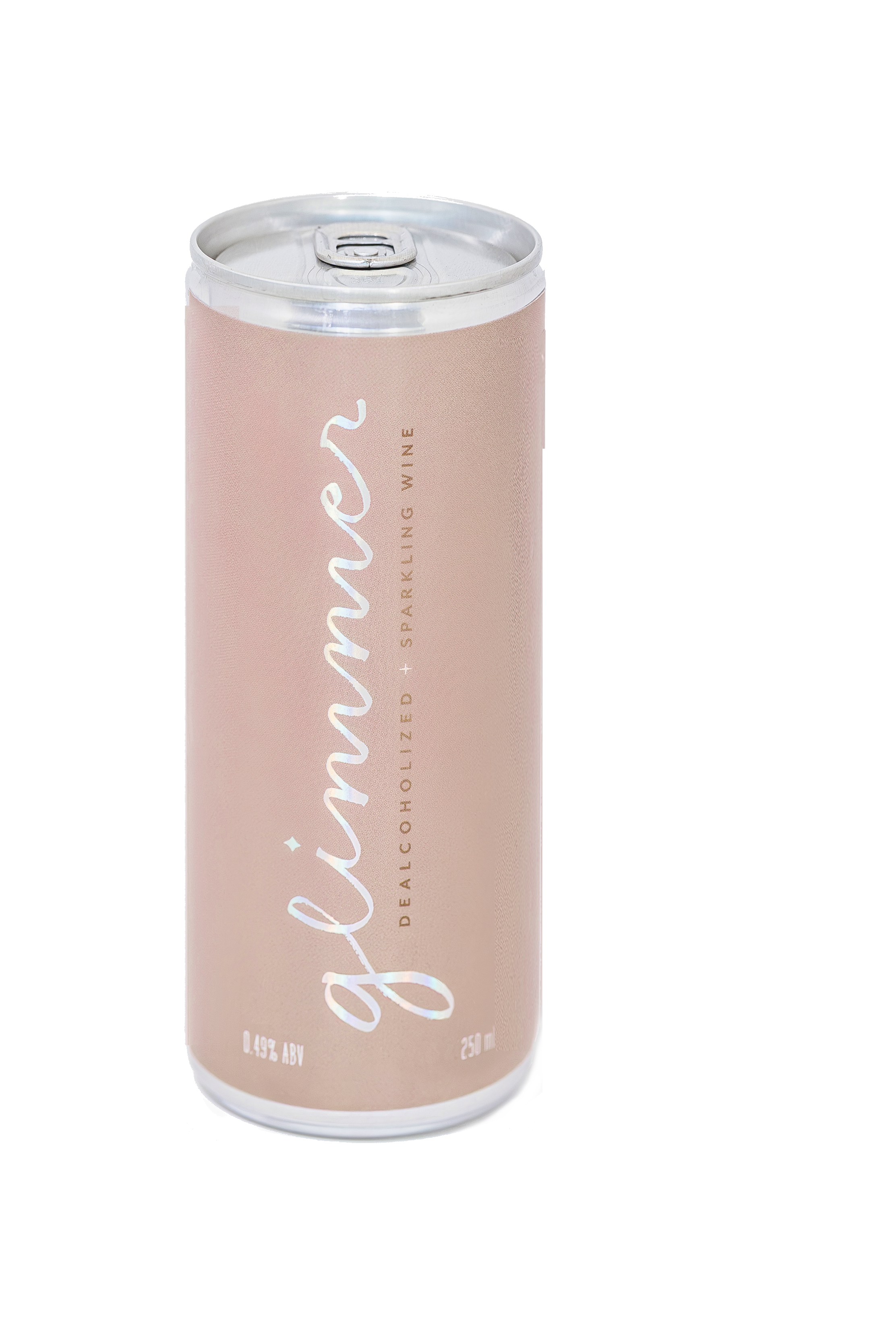
Packaging carries the same restraint as the rest of the brand: a blush or bronzed label, the script wordmark in white or foil, and small Questrial type for the fine print.
Editorial, not staged.
Photography feels like a beautifully documented gathering, not a studio ad. Soft natural light, real tablescapes, genuine moments of connection — organized seasonally rather than by event.
Light
Warm and natural — golden hour, candlelight, soft window light. Never harsh flash.
Moments
Toasts, dinners, quiet evenings at home — connection over posed product shots.
Palette
Cream linens, blush florals, gold rims — imagery should read as an extension of the brand palette.